The 'X' on the XX album defines there status as is a reco
gnisable symbol to many who support and follow the band, The white X on a black background is very effective, the simplicity of the colours automatically stand out defining the X to the viewer. They have taken a minimalistic approach to there cd cover, much like there music. The XX marketed themselves by displaying several 'X' posters around places, making the public question what it stood for leading them to the band. The xx use a variety of coloured X's to represent different singles they release, each colour reflecting there mood. I am not going to use a 'X' as this is too similar to there's and would not
reflect my music video. Within my Digipak I am going to use still shots from my music video to represent the artist.
Below is a de-constructed version of the XX album cover:

I also looked at snow patrol's eyes open album cover, an indie band signed to a major record company polydor records
Snow Patrol's cover is built up over a serious of layers, combining artistic elements to create visual impact. It represents a stereotypical indie band through the use of colour, image and typography. At first glance we see two people, held in each others arms, this connotes a very affectionate image, but as we look further the colours connote a different message. Dark dull colours have been used, which conflicts against the engaging embrace that seems loving, conveying that there is something else going on within the image. The fact that the figures are not full and are missing faces, maybe reflective of the album title eye's closed, as there is no facial expression and your imagination has to be used to see the object.
The typography used in this album cover is again very stereotypical of the indie/alternative genre. Block capitals with a slight gritty appeal to them have been used, conforming to the convention of indie style.

This is Four Tet's album cover for there album DJ Kicks.
Four tet is the stage name for Kieran Hebden a post-rock,alternative and electric musician.
He has worked with artists such as Bonobo, Sia, Radiohead, Aphex Twin and Manic Street Preachers.
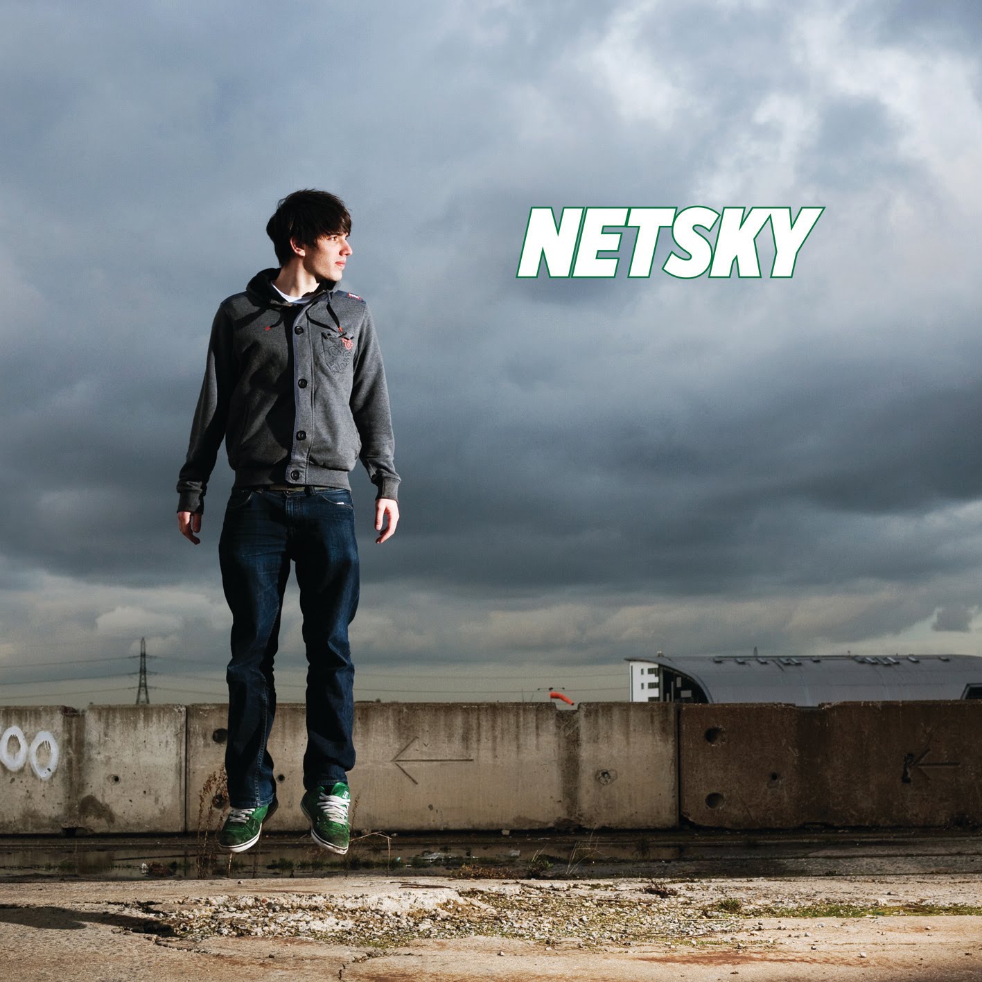
I also looked at other album covers from genres such as Drum and Bass:A shadowing effect has been used to display the artist creating a visually appealing cover.
The colours used for the logo are simple yet affective, they are representative of his music, very calm. The layering of the faces reflect the artist, the artist himself is featured on the cover, the repetition of his face could represent the many sides to his music, the sub genre's within the main style that he creates.

This is another of Four Tet album covers for 'rounds'. It has a more minimalist approach, combining a bullet which is represents 'rounds' with bullet holes. The cover would have a very niche audience, most Cd covers display the artist. From my research into cd covers, I have decided to stick to the forms and conventions of indie cd covers, I will use an urban loaction and feature the artist on the cover, although when creating the digipak I may take a more artistic approach to the inside and cd itself.
Below is Netsky's album cover

No comments:
Post a Comment