Wednesday, 16 February 2011

How did you use new media technology in the construction,research,planning and evaluation stages of your media product?


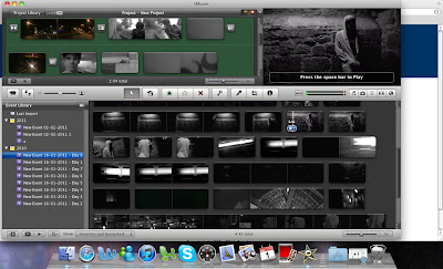
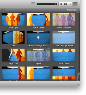
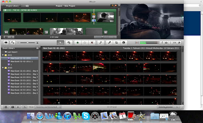
In the constructional stages of my media product I used Imovie to edit, import and produce my music video. Imovie is a proprietary video editing software application which allows Mac users to edit video footage. In imovie a variety of features where available to help produce an aesthetically pleasing product. The first of which was transition effects. Normally within conventional music video's not many transitions are used as it is mostly cuts, but as I had a variety of footage the best way of editing this was to use transitions. The technology of Imovie allowed me to add a transition to my video in just one click. This was good as it was very time saving.Within my media product the transition cross disolve was used at a variety of stages to interlink two different clips, the first being the time lapse and the second being the character walking, this can be seen below as I have changed the transition time so that they overlap for a longer period of time:
The technology of imovie also allowed me to filter footage very quickly and upload to youtube.


Youtube is another new media technology that I used in the construction, evaluation and research stages of my media product. From Imovie I could directly export my final product to youtube, this was ideal as the technologies interlinked making it a very user friendly experience. Youtube also allowed me to gather ideas and shot angles for my product, YouTube is a video-sharing website on which users can upload, share, and view videos. As youtube is one of the largest video sharing sites it had a vast array of music videos, both professional and novice made.Youtube was vital to the planning stages of my music video, without it then I would not of had a time lapse in my video or I would not have a variety of shots. Youtube also allowed me to plan the costume within my media product. As youtube is so large it had many videos from the niche audience of indie.

Youtube within the evalutional stages of my media product was vital. It allowed me to show my video to a very large audience. Uploading my video to youtube meant that I could see how many people viewed my video, if people liked it, there feedback, and where the video was most watched and if it had been referred from other music videos.Idvd was used to export my media product onto a dvd so that it could be watched. Idvd again was very simple to use, just choose an effect and burn your video to a disk: In film, software is used in some areas of production, this is an example of that: Within the construction, research, planning and evaluative stages blogger was very useful. it allowed me to put all of my ideas, research and evaluation into one place that was accesable via the internet. It also allowed me to upload videos to my blog, insert images and slideshows so that it was not just plain text. This was important as it meant that my thought processes could be viewed from start to finished product:
Other new media technologies such as facebook could be used. Although I did not use facebook to get constructive criticism of my product, It would of been useful to do this, as you would get an honest opinion from people around you, rather than want you wanted to hear from class feedback.

Blogger, facebook and flickr can often be referred to as cyberculture meaning a network of social aspects rather then cultural objects such as mobile phones.

Whilst getting feedback from a cybercultures, a cultural object i.e mobile was used to view my video on youtube which I found very good for only 50 something views.

Iphoto was used in the construction processes of my ancillary tasks, it was used to import my photos and correct the colour of them. Iphoto was very basic so create my actual ancillary tasks I used Photoshop Cs4
Photoshop Cs4 allowed me to create an aesthetically pleasing product, something that used a variety of processes to create an end product rather than basic manipulation on iphoto.


What have you learnt from your audience feedback?


From my audience feedback I have learnt that it is vital to gather a variety of views, from various locations, networks and websites. The main type of audience feedback I used was Youtube. Youtube allowed me to have statistics on where my video was being watched, how many views it had, if it had been viewed from a mobile device and whether anyone had liked my video. I learnt from my audience feedback that it did not just attract people from the uk, but also from france and australia. Youtube allowed me to see this on a map of where my video had been viewed. I also learnt from audience feedback that new media technology is a good way of getting a product into the market, within 12days my video had gained 66 views from the public very few being from the people I knew as I did not put my video onto facebook. Another way in which I gathered audience feedback was through teachers and classmates, the first time my video was watched I was told the introduction was good although it was too long and needed to be editing and merge with other footage. This was good as I could gather information on how to make my product more appealing and not boring.
Another form of Audience feedback was polls on my blog. This wasn't very effective as not many people had the link to my blog address meaning that only one person did the poll on my blog.

How effective is the combination of your main product and ancillary texts?

My ancillary Cd cover and ancillary Cd back cover


Above is my ancillary cd cover. Continuity is used to create an effective product. Urban locations are used throughout to create a link between the video, cd cover and magazine advert. I have used the same image from the cd cover as the magazine advert as this is conventional of magazine adverts promoting cd's.

The familarity between the cd cover and magazine advert can be seen:


The same artist is used, the same locations as in the music video are used also.
I feel that the combination of the three products are effective as there interlink through artist, colour, location and style.
As you can see my magazine advert uses the same picture as the cd cover and uses the same artist from the music video.

In what ways does your media product use, develop and challenge forms and conventions of real media products?

My media product develops challenges and uses forms and conventions of indie music videos. Conventions such as: tendency to film in black and white has been used throughout the video. The artist has also been shown at various stages and dark urban locations have been used.
Using these conventions makes the video recognisable as indie and is useful in continuity.

A way in which forms and conventions of indie music videos is challenged within my product is the use of time lapse, time lapse is used at various stages throughout the video, faded in and out to show the passing of time. Although the time lapse is in the form of a movie car, it has been speed up to create this effect.

I decided to conform to the tendancy to be filmed in black and white as it makes the video recognisable from other genres.The artist is shown at various points throughout the video, this is conformant of indie music videos.I have also conformed to conventions by using dark urban locations, the location I have used is exeter. Most of the footage was filmed in pedestrian subways, meaning that there was ideal lighting to create the desired effect.

I have slightly developed costume within my product. Indie style usually consists of checked shirts, skinny jeans and trainers, I have replaced the check shirt with a hoodie to attract a younger audience, but this still reflects the song's genre

I have developed the convention of Colour’s reflecting the song’s genre, by using both colour and black and white. I used the time lapse in colour, but filmed at night to conform to dark locations, but the colour is shown within lights etc.

I have choosen not to use the convention of band performance as I wanted a more disjunctured video. Something that could be creative and slightly different to appeal to a niche audience. Also I have cut between locational shots and the artist.

As I choose a disjunctured music video, I therefore didn't need to have a storyline. I think that it would of been more effective to have a storyline as the audience has something to follow, although I think that my product was still effective.

Tuesday, 15 February 2011

Finished music video


Above Is my finished music video for the XX - Intro.
The version I handed in was accidently over-exposed in places and the ending went on for too long so the above video on youtube is the correct one.

Monday, 14 February 2011

Questionnaire

In order to analyse my questionaire results I decided to turn them into pie charts as the data was easier to see. From my questionaire I can see that the majority of my audience were intrested in drum and bass but this was hard to create a music video for, so I decided to choose the 2nd most popular choice and go with indie music.
I also need to find out the age of my target audience so I could adapt the video to suit there needs. From my feedback I found that 45% of my audience were going to be between 17-25 so I decided to appeal to them.
The music was accessed most by youtube with 50% of my target audience accesessing there music video's this way, I therefore am going to use youtube as my main way of gaining feedback and getting my video out there.


Costume


Costume is an important part within music videos and it helps convey a particular message and style. I am representing the character within my short film with a hoodie, skinny jeans, a backpack and old trainers. The skinny jeans and old trainers are conventional of the indie style so I am conforming to this convention.
A plain grey hoodie is what my character will be wearing, it's very plain and does not seek attention, it also keeps the costume simple.


He will be wearing skinny jeans to conform to the conventions.


Old trainers will also be worn to meet the indie style.
A backpack will be worn to convey that the person is travelling, it also fills part of the frame and draws attention due to it's size.

Advertisement analysis

In basement Jaxx advertisement, bright colours have been used to attract the audience, as well as the bands logo to be familar with the audience making them instanly recognise it. The album is called 'rooty' this can be seen as the advert has been designed to reflec this: Gorilla eating a plant root. Basement Jaxx somewhat outthere and creative style is obvious in this advert and is reflective of their genre. Key elements of adverts have been used, release date, artist name, album name.


Another Cd advert I analysed was muse's the resistance. It relies on the visual aspects to attract it's audience, rather than information. The bright colours are intresting and make the viewer want to know what it is. Jay-z is a hip hop artist, so his advertising style is very different to those from other genres

Thursday, 3 February 2011

Filming and equipment


The camera I used to film my music video was a canon hg10.
This was good as it recorded to avchd and did not need tape and was easy to transfer footage onto a mac. The only downside was that the battery life was poor and lasted around 1 1/2 hours so I had to record footage on seperate days. The other piece of equipment I used was a macbook air, this was useful as it was light and portable, meaning that I could take it with me. It also had a later version of imovie, which meant it had more features. I could also use this at home.

Shot list

Shot Type

Why/when used?

Close-up

Close-ups are obviously useful for showing detail and emphasizing facial features and can also be used as a cut-in

Mid-shot

The mid shot shows some part of the subject in more detail, whilst still showing enough for the audience to feel as if they were looking at the whole subject

Wide-shot

The subject takes up the full frame

Extreme close up

Show extreme detail

Cut away

Shot of something other than the subject

Two-shot

Shot of two people, framed similarly

Over the should shot

Looking from behind a person at the subject

disturbution

My product will be distributed via the internet on websites such as youtube and vimeo.
It will also be distributed via the band website but could also be distributed as digipak, this will reach a larger audience.

Filming diary

Social networking


Cyberculture/ social networking is important in the distrubition and feedback elements of my media product.

Digipak Research: Existing products

In order to create a cd digipak, I needed to look at existing products from my genre and analyse them. I looked at The XX own cd :
The 'X' on the XX album defines there status as is a reco
gnisable symbol to many who support and follow the band, The white X on a black background is very effective, the simplicity of the colours automatically stand out defining the X to the viewer. They have taken a minimalistic approach to there cd cover, much like there music. The XX marketed themselves by displaying several 'X' posters around places, making the public question what it stood for leading them to the band. The xx use a variety of coloured X's to represent different singles they release, each colour reflecting there mood. I am not going to use a 'X' as this is too similar to there's and would not
reflect my music video. Within my Digipak I am going to use still shots from my music video to represent the artist.
Below is a de-constructed version of the XX album cover:

I also looked at snow patrol's eyes open album cover, an indie band signed to a major record company polydor records

Snow Patrol's cover is built up over a serious of layers, combining artistic elements to create visual impact. It represents a stereotypical indie band through the use of colour, image and typography. At first glance we see two people, held in each others arms, this connotes a very affectionate image, but as we look further the colours connote a different message. Dark dull colours have been used, which conflicts against the engaging embrace that seems loving, conveying that there is something else going on within the image. The fact that the figures are not full and are missing faces, maybe reflective of the album title eye's closed, as there is no facial expression and your imagination has to be used to see the object.
The typography used in this album cover is again very stereotypical of the indie/alternative genre. Block capitals with a slight gritty appeal to them have been used, conforming to the convention of indie style.

This is Four Tet's album cover for there album DJ Kicks.
Four tet is the stage name for Kieran Hebden a post-rock,alternative and electric musician.
He has worked with artists such as Bonobo, Sia, Radiohead, Aphex Twin and Manic Street Preachers.
A shadowing effect has been used to display the artist creating a visually appealing cover.
The colours used for the logo are simple yet affective, they are representative of his music, very calm. The layering of the faces reflect the artist, the artist himself is featured on the cover, the repetition of his face could represent the many sides to his music, the sub genre's within the main style that he creates.
This is another of Four Tet album covers for 'rounds'. It has a more minimalist approach, combining a bullet which is represents 'rounds' with bullet holes. The cover would have a very niche audience, most Cd covers display the artist. From my research into cd covers, I have decided to stick to the forms and conventions of indie cd covers, I will use an urban loaction and feature the artist on the cover, although when creating the digipak I may take a more artistic approach to the inside and cd itself.

I also looked at other album covers from genres such as Drum and Bass:
Below is Netsky's album cover

Wednesday, 19 January 2011

Cd cover

This is the cd cover I made using photoshop cs4 for the xx album:
I tried many variations in colour to create the indie style, but ended up goign for the conventional black and white. I used stills from my music video to create the cd cover and back cover, and to create continuity I used the same location. I have also stuck to forms and conventions of cd's by have the conventional artist on the front cover. I have also included a bar code and track listing.